TNS Experts
This post was submitted by a TNS experts. Check out our Contributor page for details about how you can share your ideas on digital marketing, SEO, social media, growth hacking and content marketing with our audience.
Do you know what are the mistakes that graphic designers make while creating logos? If not, here's a blog that mentions top critical mistakes that graphic designers need to avoid at any cost.
Everybody can make mistakes and learn from them but when it comes to creation of your own logo, mistakes are probably the first thing you want to avoid. Sometimes these mistakes can be fatal and cause more damage to your business than a bad management or wrong business decisions.
We offer you a list of Top 10 Crucial Mistakes When Creating a Logo. Some of them may seem funny while others are really dumb. Better learn from mistakes of others, don’t you agree?
Sense of humor is required and highly appreciated but you need to know where to draw a line. Trying really hard to make your logo funny and amusing may lead to some unpredictable consequences. If you use some black or vulgar humor, you will probably attract lots of attention, and not only inside the country.
You’ll definitely achieve your object and people will be laughing at your logo. However, black PR is not always useful, first and foremost when it comes to logo design. For instance, Japanese company Kudawara suggests its clients to use their imagination.
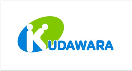
The logo has soon become madly popular among the Internet users but it hasn’t added any additional clients to the company. They prefer to laugh at it but choose other pharmacies (for Kudawara is a pharmaceutical company).
You logo presents your company, it’s associated with your company and that’s why you should be very careful while choosing it but even the well-thought concept is not enough. Imagine that you’ve spent months choosing a proper logo and now finally you have it.
You print it on different souvenirs and give them to your clients as a gratitude for their work with you. Then, you’re sitting on the top of the world after finding out that your clients love your presents and especially your logo. One day one of your grateful clients comes to you and asks you of the meaning of those two green stripes depicted on your logo. You reply that they have no meaning at all; they simply looked great on mouse pads. Not cool, right?

Your logo has to be meaningful. Take Mercedes, for example. Three lines in their logo symbolize being a leader of three elements: water, earth and air. Indeed, Mercedes has proved its leadership and therefore its logo is easy to understand.
Letters in your logo carry the biggest part of information. They are the first thing your clients consciously refer to. That’s why if you choose the wrong font the logo can be considered to be useless. What is wrong when we’re speaking about font?
Firstly, it can totally fall out of the created visual image which is the reason for the discord.
Secondly, it can be trivial and old fashioned. If we’re speaking about Comic Sans MS or Times New Roman, how many successful design logos have you noticed that contained the fonts like those? These fonts are mostly used by amateurs, as far as real professionals aren’t afraid of experimenting.
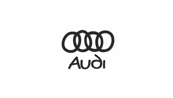
Now, you understand how important the font choice is and you want to do your best in this sphere. That’s why you come up with several great fonts. Not knowing which one to chose, you decide to stuff all of them into your logo to give others an opportunity to enjoy them.
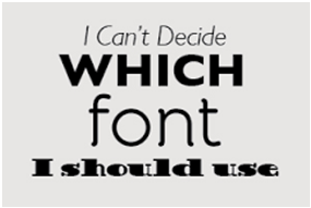
As a result, your logo is blurred, your clients are not quite sure where to look and you suddenly realize that was a very, very bad decision to make.
It’s only natural that you will be browsing a lot of other logos in order to understand what you want yours to look like. You may even find some logos that you think would be perfect for you. The only problem is that they are already taken.

In this case, try to understand what exactly is so great about these logos. It may be the combination of colors, some particular shapes etc. Then, ask professional designers to help you. They can figure out how to make your own logo and stick to whatever ideas you liked in previous ones. Professional designers will never copy them; they design the logo that will meet all your requirements.
Think of the colors twice or even three times. Afterwards , think of your target audience and whether those colors will be apprehended the way you need. It requires a lot of studying. If you choose wrong colors, the logo will fail you for sure.

“Yes, I like this plain grey, I think it’s calm and will be nice on my employee’s uniform”; “No, I don’t want to simplify it, I want it to be posh, with all those stripes, stars and sparkles”; “Nah, I’m not sure what I want, do as you like”.

These phrases are your worst enemies. Try to listen to your designer: in such situations he will be your best friend. Don’t be afraid of communicating with him for both of you have the same goal: you want your logo to be outstanding and to be effective. Every web designer wants his works to become master pieces in the Internet that’s why don’t hesitate to ask questions and take into consideration the advice of professionals.
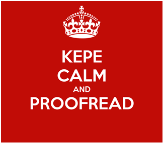
This is the silliest mistake. You have a perfect logo with the most suitable colors, interesting fonts and a catchy concept itself. Oh, and you have a spelling mistake in your logo as well. Unfortunately, such things do happen. Nobody will trust you if you have a mistake in your logo, it’s a fact.
It shows a lack of creativity and nothing more. Using images of a poor quality can do no good in creating a logo. They are old-fashioned and simply lose a competition to modern technologies.

It’s always difficult for your clients to get used to changes in your logos. Especially if the changes aren’t really good ones. Think of football logos, for example. Thus, Atletico Madrid have decided to change their emblem recently in order to simplify their logo. They decided to remove green leaves on the tree and make the bear look in another direction.
The changes are logical and therefore were warmly accepted by the team’s supporters. Some say that in comparison with the new logo the old one was pretty ugly.
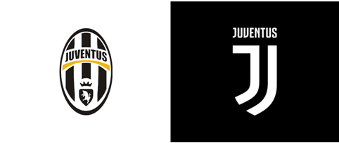
However, there is one more football team which logo has recently been changed as well: Juventus. Its nickname is Old Lady and it has had an imposing logo that filled the other teams in Serie A with apprehension till they decided to pursue fashion. That’s why they simplified the emblem as much as it was possible and stumbled upon the burst of indignation of their own supporters.
Why the reaction was so different? Everything depended on the amount of changes. They had to be gradual and there was no need to shoot from the hip. Moreover, you should always listen to your clients’ opinions – it refers not only to the logo upgrading.
You’ll also receive some of our best posts today

This post was submitted by a TNS experts. Check out our Contributor page for details about how you can share your ideas on digital marketing, SEO, social media, growth hacking and content marketing with our audience.

Mobile devices have become an integral part of our lives in this digital...
Don’t miss the new articles!