Mayank Singh
Mayank Singh is a web designer and CRO expert at The Website Times. He helps businesses increase their online revenue by making highly optimized websites for them.
Learn how to improve your website's 'Contact Us' page by avoiding these 5 deadly mistakes. This blog provides insights on how to fix them and enhance user experience, making it easier for your customers to reach out to you.
The contact page is in the top 4 most visited pages on most websites. Whenever anyone wants to contact you, they start finding where the contact page is.
Unfortunately, the contact page is overlooked, which results in a decreased number of leads to the company and increased frustration for the users.
Optimizing it should be an utmost priority for your business. So, let's have a look at five of the most deadly mistakes on the ‘contact us’ page, and how to fix them:
If any user is willing to contact us via the website, then they look for the preferred ways of contacting you. And if they don’t find a preferred way, then they won’t contact you.
These are five ways of contact that users expect to see on the ‘contact us’ page:
Email has always been one of the primary ways to contact since the arrival of the internet. And a lot of users still prefer contacting a company via email.
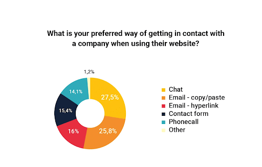
Businesses try avoiding them, as adding an email attracts a lot of spam. But we should let the users decide what’s best for them by adding it.
Also, users prefer first copying the email address to their clipboard, and then paste it on any e-mail software. So, we should make it accessible for them to copy it.
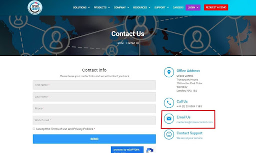
But some users also prefer using it as a direct link. Hence, it’s our responsibility to make the email address easily used in both ways.
Since the time of yellow papers, the phone number has been the most popular means to contact a business. And it will always be one of the most popular ways.
The phone number on your website builds trust and conveys a message that you take your business seriously. Even if you are a multinational company or a local business, adding a phone number is crucial.
If your business operates in multiple countries, then you should always add a phone number for that country.
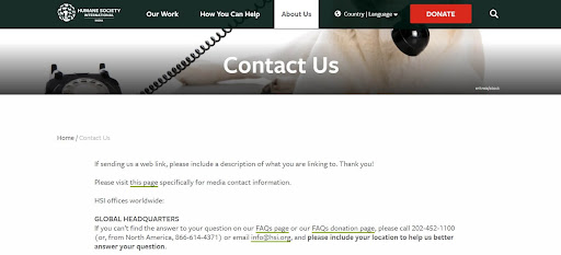
Humane Society operates in multiple countries but they have provided phone numbers only for America. They also don’t have a live chat and they don’t respond via e-mail, which decreases their trustworthiness and frustrates users.
One of the fastest emerging ways to contact a company is live chat. Companies underestimate how important it is to have a live conversation with users and live chat functionality, provides you to do just that.
In my experience of being a freelancer, whenever I replied to my clients right away and had a live chat with them, 90% of the time they became my clients. And if it took me 12 hours to get back to them, they most probably were talking to some other agency and I lost them.
Qualities of a good live chat experience:
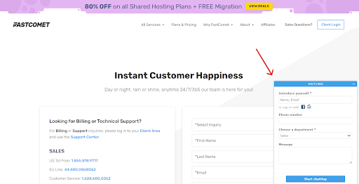
FastComet company provides you with a response from a real person 24/7/365, and they usually get back to users in 1-2 minutes, which is an extremely good user experience.
If a user clicks on the ‘Contact Us’ link, then they always expect a contact form on it. Adding a contact form is a convention for the websites. Hence, you should always add them.
Also, the information from online forms is easy to manage for a business and they eliminate a lot of spam via features like reCAPTCHA.
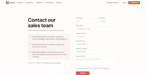
Notion's contact form is very well optimized
Trying to make a fancy contact page that doesn’t has a contact form is definitely a mistake.
If your business requires clients to come to your address (like local businesses), then you should definitely add the headquarters address to your website.
And even if clients don’t need to come to your address, then also you can add it, as it builds trust and shows that you aren’t trying to hide information.
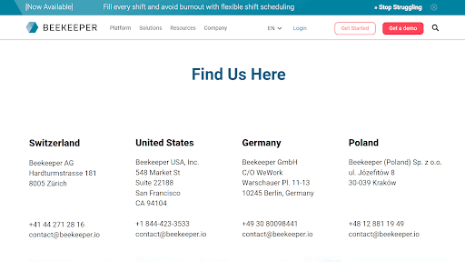
Beekeeper displays multiple headquarters beautifully
We might not even realize it, but we tend to ask many unnecessary questions in the form. Asking more questions results in an extra task for our website user.
Unnecessary questions can be of various types, let’s discuss the one by one:
Users aren’t yet ready to share all the information you might want from them. They most probably are a bit hesitant to share their information with some random website on the internet.
We must know our boundaries, and avoid asking questions that users might be hesitant to share.
For example: ‘Asking for the project budget’. Most of the users aren’t ready to disclose this information.
We should ask only the necessary questions to get started, and we can always discuss other questions with users later.
For example: Maybe you don’t need both an e-mail and phone number at the start, you can ask for the one that’s more relevant to your business.
There’s a principle in the UX world, “Don’t make me think”. In the contact form, we should only ask questions that could be answered off the top of their head.
Forcing users to think creates friction, which results in decreased leads through the form.
We don’t need to gather each & every piece of the user's information.
The contact form must not feel like a questionnaire, but a minimum required piece of information medium to get in contact with the user.
This mistake might not seem like a very serious issue, but almost half of the companies I ever tried contacting had outdated contact information.
You should always keep updating the contact information, as it’s really frustrating for users to do all the efforts and then find out that the info is incorrect.
Sometimes contact forms also stop working, so you should keep checking them from time to time.
A lot of companies tend to use creative names for the ‘contact us’ pages in the website header and footer like:
I personally made this mistake all the time. But, the website users aren’t used to recalling the contact page with such phrases.
Doing so confuses users and increases cognitive load (forces them to think unnecessarily).
A contact page is mostly referred to as ‘Contact Us’ or ‘Contact’. So make sure to avoid using such fancy names for the contact page in the header and footer.
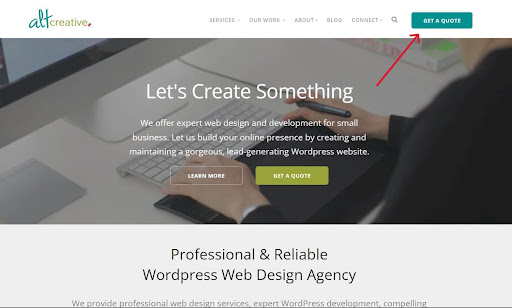
A website using ‘Get a Quote’ CTA in the website navigation
Asking to contact your team is too generic nowadays, we want to get our user's attention by being more personalized than everyone else.
Ways for making your contact page more personal:
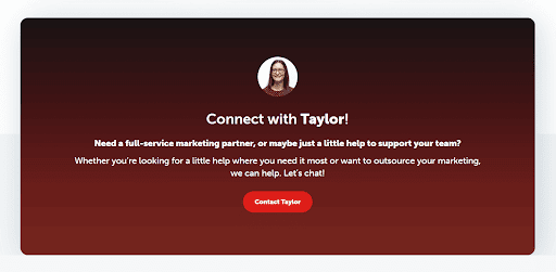
Contact Banner of Gravity Group has personalized contact information
We discussed major mistakes for contact pages. Here are a few more mistakes to consider:
Sharing all the required information in a well-organized and aesthetic way, the Freshworks contact page is a really good example.
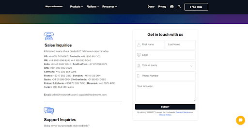
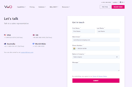
The website designs of VWO are top-notch, and the contact page is no exception. All the elements needed to make a powerful contact page are present in it.
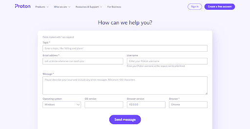
The contact form on the Proton contact page is extremely well-optimized for user experience. From this form, we can learn how optimizing small design elements makes a big difference.
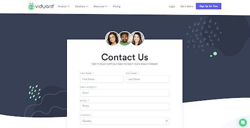
Vidyard, a sales video software company uses a well-structured and personalized contact page, with beautiful UI acting as the cherry on the top.
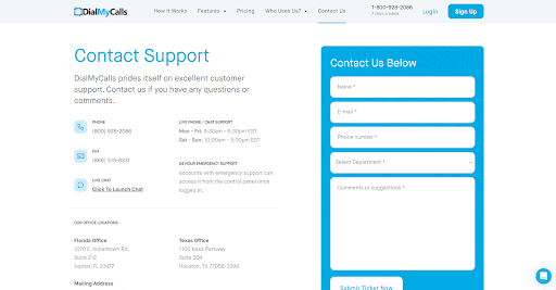
Another example of an ideal contact page is from the DailMyCalls website. This website has nailed all the factors needed to make a perfect contact page.
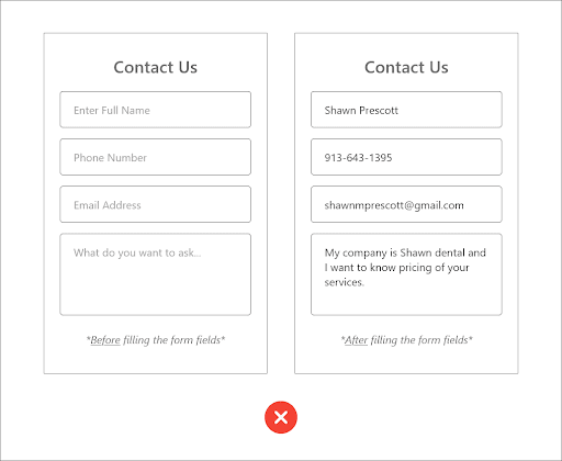
Overall, a contact page is a crucial part of any website, and optimizing to its full potential is necessary.
Following the above steps you can make a form that would be highly optimized for building trust with you and then easily reaching out to you.
You don’t need to follow all the principles to the tee, but consider them as good pointers and find your own sweet spot.
You’ll also receive some of our best posts today
Mayank Singh is a web designer and CRO expert at The Website Times. He helps businesses increase their online revenue by making highly optimized websites for them.

Mobile devices have become an integral part of our lives in this digital...
Don’t miss the new articles!