TNS Experts
This post was submitted by a TNS experts. Check out our Contributor page for details about how you can share your ideas on digital marketing, SEO, social media, growth hacking and content marketing with our audience.
Do you want to optimize your eCommerce checkout process for more conversions? If yes, check out this blog today!
There’s hundreds of ways to get someone to leave your site or abandon your shopping cart. Find out different tricks and trips that can help your site convert at a higher percentage.
There’s nothing more irritating for a buyer than hidden fees. You’ve found the item you’ve wanted, found the right price and are ready to make the purchase. Now you’re in checkout and the price is significantly higher than you expected. Many people will leave the checkout and go buy the item elsewhere.
Customers understand there are fees associated with shipping, taxes, etc. However, customers do not want to see these fees popping up unexpectedly. Be straightforward with your customers by clearly showing them any fees that may apply. Don’t surprise them with fees, this is how you get people to leave your site.
Users are very skeptical when it comes to providing personal information, especially credit card information. It’s important to show your customers that you are running a respectable, professional company. To show your customers your site is trustworthy there are a few different items that you can add to the site.

First, it’s important to make your site secure, https vs http. Many users won’t put any information into a site that is not secure. Next, add badges to your site that will help customers know the site is safe and secure. These seals should be placed both on the site where everyone can see, plus throughout the checkout funnel.
Often you’ll see eCommerce websites that utilize a checkout platform from another source. This may redirect the user to a new domain, which can confuse shoppers. If you are selling on widgetdeals.com and a user clicks add to cart, then checkout. All of a sudden they are taken to shopping.ecommercemarket.com, now they are confused on what site they are on and what they are purchasing. Next they will abandon the purchase, and find the product elsewhere. Keep checkout on your domain!
Should you utilize a multi-page or a single page checkout funnel? Many people will argue which one is more effective, but ultimately it will come down to your testing to determine which is better for your site. There are arguments for each setup, and different sites have experienced different results.
You’ve found your item, the price you want to pay, no let’s buy it. UGH, you have to register an account?! Too often do sites require customers to sign up or register an account before making a purchase. Customers do not always want to be a registered to a site, they want to buy something and move on. When a site requires a user to register the customer gets wary of why they must register. Are they going to flood my email with promos? Are they using my information for other reasons? These are issues users want to avoid.
Now there are ways to get people to register, but without requiring them to do it. Give users incentives to register an account, an offer can be a coupon, or free shipping. People will register with a site if they can save a few bucks.
Showing a progress bar throughout the checkout process can show users they are almost done. In some shopping carts it can take many steps to get through to a confirmation page. Users can become frustrated with multiple pages and questions, thus resulting in an abandoned cart. A simple progress bar can let users see that there are only a few additional fields left before they will be receiving their item.
Nothing can be morefrustrating than once you’ve found an item you want, you’re willing to give your money to the site, but they won’t take your payment. Sites that limit payment options risk losing a huge amount of users. Not all shoppers use the same types of payment, so it’s vital to offer multiple methods.

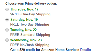
Similar to payment, it’s important to have options when it comes to shipping. Now payment options are more important to users compared to shipping, it’s important to give customers the option. Many buyers are used to using one source of shipping and they like having the option to choose.
Users can be easily distracted when they are going through the checkout process. Limit the ways users can click out of the shopping cart, where they can forget what they are doing.
Let's look at Amazon as an example. Once into the shopping cart users have the options to click their address, their payment, etc. However, they do not have the option to click different categories, items, or sections of the site. They have removed the navigation which can give users a place to leave.
Throughout this article we have mentioned a few different options on how to build your checkout process. The only way to realize which tips will help your cart is to test. For instance, are you not sure if you should have a single page or multi page checkout process? Try both of them, track, and see which one converts better. Try removing your navigation from the checkout cart, and see if your abandoned carts drop. Every site has different results so it’s important to see what works for different sites.
Author
Chris Hickman is the Founder and CEO at Adficient with 14 years of experience in search marketing and conversion optimization. In 2006 he founded Adwords Suspension and Google penalty removal & recovery service at GetBackonGoogle.com to help businesses and websites to get back on Google.
You’ll also receive some of our best posts today

This post was submitted by a TNS experts. Check out our Contributor page for details about how you can share your ideas on digital marketing, SEO, social media, growth hacking and content marketing with our audience.

Mobile devices have become an integral part of our lives in this digital...
Don’t miss the new articles!